I like the bottom one. Your owls are adorable, but they are somewhat common at the moment. I think the bottom one is more unique and a great example of your style.
I like 1st one better but I think it's because I love owls. They're so trendy too. And your shop name and address in brown block shown much clearer than what you did on the 2nd one. bu
Hands down the owls! I think the clarity of your shop name contrasting a dark color, with one simple photo of a design that has more character is successful. For ads, they need to visually be simple, but with colors that bring in a lot of contrast to draw the eye.
I am going to stick my neck out and say that I prefer the bottom one. I love the owls but they could be geared to a specific younger market. The other design fits all generations. Like it.
I'm going to be even more of a pain and say, I like the owls but the color on the bottom invite pulls you in more with the exception of the banner. I think the banner in brown is bolder and draws your eye to your name more. Perhaps experimenting with the brown banner on the bottom design might be a good idea. I love the howls but when you have a tiny ad like this, I think color really grabs you and you have bold colors on the bottom design and it's a really fun non-specific design as well. Good luck! :)
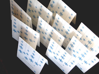
EtsyGreetings is hosting a fun blog carnival all this week. I'm participating and giving away a set of 10 line of snowflake cards, you choose the color, strawberry, green, blue, or purple. To participate in my giveaway, just leave a comment below with your favorite item from my Etsy shop . I'll choose a winner at the end of the week. To enter to win other fun prizes offered by the many talented members at EtsyGreetings, stop by our blog for a linked list of all the giveaways happening this week.
The violet invitation design in rainbow colors with gold. LOVE, LOVE how they turned out! I was excited when designing them digitally but seeing in print on natural white made me gush with joy! The bride loved them too. The gold envelopes add an extra touch of excitement along with the invite and postcard rsvp. These are the save the dates, in greens and blues and grey. (they did have rounded corners too, in my excitement to photograph while the sun was out and wind was low, I obviously forgot to round the corners) Planning a wedding or event? I'd love to work with you. Send me a note s tephanie@steliedesigns.com


Comments
Cara
www.CarasScrapNStampArt.blogspot.com
Hope that helps!
The two things that make the top ad layout better are having your name at the top, and the legibility of the light type on the dark background.
(Both are great cards, though! ;)